|
Via AATCC |
|
|
For many industries, including fashion apparel, textiles, and interior design, color is a major buying signal. Technology advances have allowed brands to offer extensive color ranges, resulting in color making-decisions in every aspect of modern life.
In business, getting the color right is so important that color trends, specifications, and design have become a growing international multimillion dollar industry. Akzo Nobel, (a global paint innovator and producer) recently announced Copper Orange as their color of the year. The Pantone Color of the Year is Marsala. However, understanding the world of color is tricky. Customers do not know basic color theory. For instance, how many can explain "brown," and the difference between various shades of brown, like, for instance Copper Orange and Marsala? In our experience: very few. Most people can perceive the difference between two swatches, but are unable to analyze it. They are "color illiterate." An illiterate person can see the difference between two words: "door" is shorter than "window." The first has two circles in the middle, while the latter starts and ends with the same sign. But, how are they related? What makes them different? Similarly, the color illiterate is limited to perceiving that two given colors differ, without understanding why. Part of "reading" color is being able to analyze two swatches and say: "this brown has lots of red with a little black, whilethat brown is a grey close to black with a touch of orange." In other words, to be able to find, mix, and match—actively and intelligently.
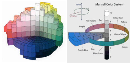
As children, we all had to work hard to learn how to read. For most, it started with building blocks of the alphabet shown in a fun visual way. Slowly, we moved to increasing complexity. Many color professionals however, may have begun their career because of natural talent. "Reading" color seemed easy to them. They "read" color by intuition—just like some people have a natural talent for music. This sparked their interest and they were able to quickly advance to higher levels, no longer needing to think about what "brown" is or what "chroma" or "saturation" is. They just knew it—or at least think they know. However, can they explain a basic color term like saturationto an average person—to their neighbors? During my personal exploration of color, I have been lucky to meet with hundreds of designers and related professionals. I have often asked if they are able to explain saturation so that everybody can understand. This seemingly simple question is hard to answer! The experts come up with vague and imprecise answers like "it is more intense," or "it has lots of color," or "it is pure." Are Copper Orange and Marsala intense? Pure? Do they have lots of color? The average person next door is likely to be at loss with these kinds of explanations. It seems to me that this is the basic building block missing in the knowledge of the general public: understanding saturation. For a long time, it was believed that our world is flat, 2D. Now we know that it is round and 3D. But with color, how many people know that color has three dimensions (hue, value, and saturation), and can therefore be represented as a 3D sphere? Ordinary people today are still struggling with 2D color tools that have not really changed for decades.
Flat, 2D presentations, offer no connection between the color at the left and the color at the right. And by the way, where are the browns? How can the average user understand how the browns relate? To work with color using those kinds of tools, is like planning a trip from San Francisco to Tokyo with a 2D map. You would go eastbound and cross the US, the Atlantic, Europe and Asia—how could you, from this map, do anything else? You have to KNOW it to understand that the world is round and that you can go westbound from California and reach Tokyo.
My question is: have we (on a macro, public scale) somehow missed the important, basic, ABC first building blocks of understanding color? Why is color not presented more often with its three dimensions? And does it matter that the customer—and possibly, even the professional— does not understand, and/or cannot explain, the basics? On the web, CIELAB, NCS, and Kolormondo are examples of 3D models with physical 3D spheres made available by the Munsell color tree and the Kolormondo 3D color globe. The first dimension, hue, forms an equator. Value/lightness is shown from down to up. Particularly exciting is the third dimension, saturation, which is now easy to perceive as in and out; at the grey core there is no saturation. The further out you go towards the surface, the more saturated it gets.
Teaching everybody across the supply chain—including the designer and the customer—to use color intelligently is likely to reduce production costs, minimize mistakes, and speed up processes. Empowering customers to make better buying decisions will increase satisfaction and reduce product going to landfills. And all of this will lead to increased sustainability. Fun, easy to use, basic physical and web 3D color tools already exist and are becoming more widely available. So maybe it is time for a global color literacy campaign! |
What is brown— and where is it?


Leave a comment